Yesterday was the Earth Day, and I am little bit late with this manicure, but sentiment is the same.
Did you ever seen the path of distraction after crude oil would spill in the ocean... It is the reason why those two are not meant to be together, and why they really do not mix well.
We should all step away from the crude oils, and that will surely have the learning and adjusting curve, but this is the only planet we have, and we should think BIG!
I was already tired of the pastels, maybe because they were never my favorite to begin with - I always did prefer stronger, deeper, saturated colors. They also look much better against my skin tone, and preference just become my way of life.
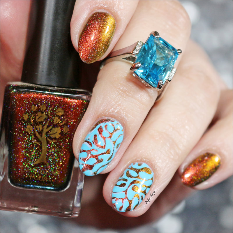
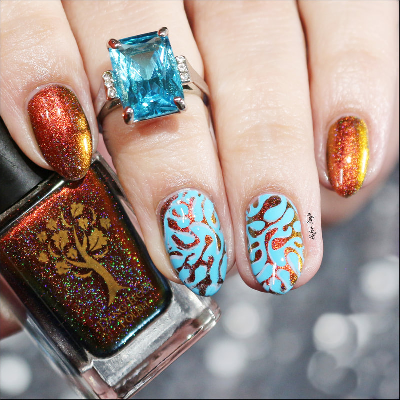
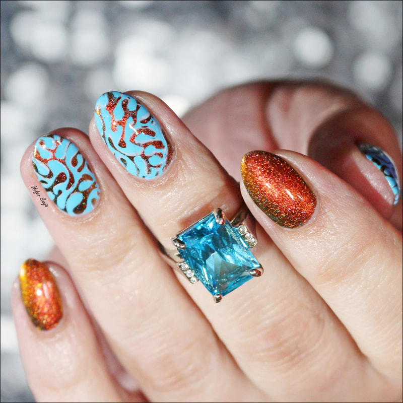
I picked up super pretty Danglefoot Polish - Champagne Supernova. Forever ago I decided that I do not like brown, but as years are passing, I am rediscovering it and liking it more and more.
This beautiful multichrome is so pretty. Color shift is from reddish brown, over orange and gold to green. I got this bottle from NailStuff.ca, and for the first purchase, you are welcome to use my discount code SANJA10 to save 10%. This particular shade is not available any more, but there are different colors to choose from.
One of my favorite color combo is brown and blue. Contrast between them is so appealing to me, you can surely see that I grew up during the crazy '70s.
My first color choice was to stamp with Hit the Bottle - Blueberry Dewdrops. This was pretty, but I wanted more contrast, so I double stamped using B. Loves Plates - B. a Blueberry.
It seems that blueberry was flavor of the day. LOL!
Image is on BBB-013 stamping plate, and reminded me of oil and water. Considering that I used the colors of both, we got the title...
We should have some pretty, sunny and warm weather over the weekend, and I have a project planned for it. Hope it will came out the way I see it in my mind.
Have yourself amazing weekend.
Cheers!
Did you ever seen the path of distraction after crude oil would spill in the ocean... It is the reason why those two are not meant to be together, and why they really do not mix well.
We should all step away from the crude oils, and that will surely have the learning and adjusting curve, but this is the only planet we have, and we should think BIG!
I was already tired of the pastels, maybe because they were never my favorite to begin with - I always did prefer stronger, deeper, saturated colors. They also look much better against my skin tone, and preference just become my way of life.
I picked up super pretty Danglefoot Polish - Champagne Supernova. Forever ago I decided that I do not like brown, but as years are passing, I am rediscovering it and liking it more and more.
This beautiful multichrome is so pretty. Color shift is from reddish brown, over orange and gold to green. I got this bottle from NailStuff.ca, and for the first purchase, you are welcome to use my discount code SANJA10 to save 10%. This particular shade is not available any more, but there are different colors to choose from.
One of my favorite color combo is brown and blue. Contrast between them is so appealing to me, you can surely see that I grew up during the crazy '70s.
My first color choice was to stamp with Hit the Bottle - Blueberry Dewdrops. This was pretty, but I wanted more contrast, so I double stamped using B. Loves Plates - B. a Blueberry.
It seems that blueberry was flavor of the day. LOL!
Image is on BBB-013 stamping plate, and reminded me of oil and water. Considering that I used the colors of both, we got the title...
We should have some pretty, sunny and warm weather over the weekend, and I have a project planned for it. Hope it will came out the way I see it in my mind.
Have yourself amazing weekend.
Cheers!